align-items in CSS Flexbox – How to Layout Flex Children
align-items specify how browsers should position a flexible container’s items along the cross-axis of the flexbox.
The align-items property accepts the following values:
stretchflex-startcenterflex-endbaseline
Let’s discuss the five values.
What Is align-items: stretch in CSS Flexbox?
Section titled “What Is align-items: stretch in CSS Flexbox?”stretch is align-items’ default value. It stretches a flexible container’s items to fill the flexbox’s cross-axis.
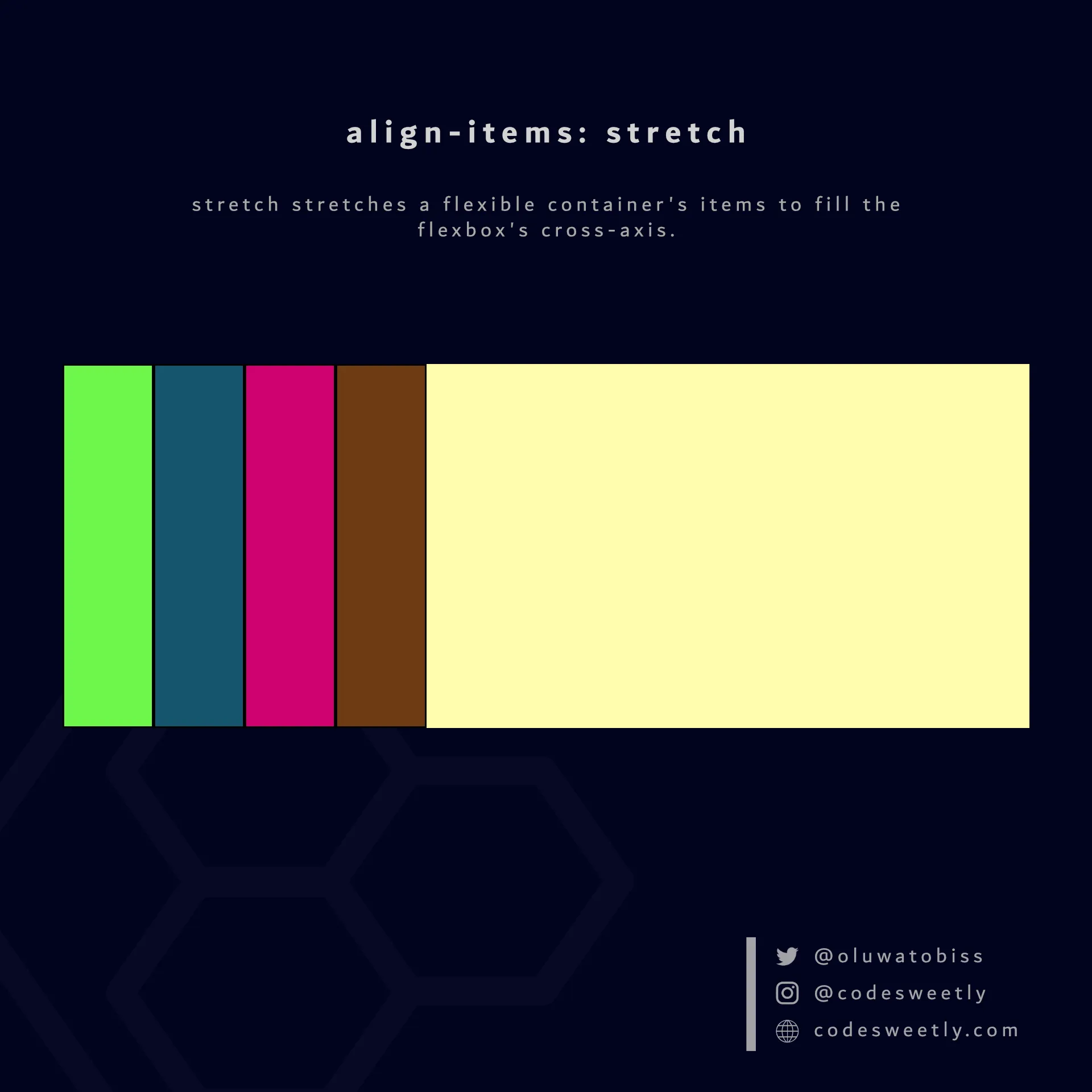
align-items’ stretch value stretches flexible items to fill the flexbox’s cross-axis
Here’s an example:
section {  display: flex;  align-items: stretch;  background-color: orange;  margin: 10px;  height: 300px;}
div { border: 1px solid black; background-color: purple; color: white; padding: 10px; border-radius: 5px;}<section> <div>1</div> <div>2</div> <div>3</div> <div>4</div></section>The snippet above used the stretch value to stretch the flexible items to fill the <section>’s cross-axis.
What Is align-items: flex-start in CSS Flexbox?
Section titled “What Is align-items: flex-start in CSS Flexbox?”flex-start aligns a flexible container’s items with the cross-start edge of the flexbox’s cross-axis.
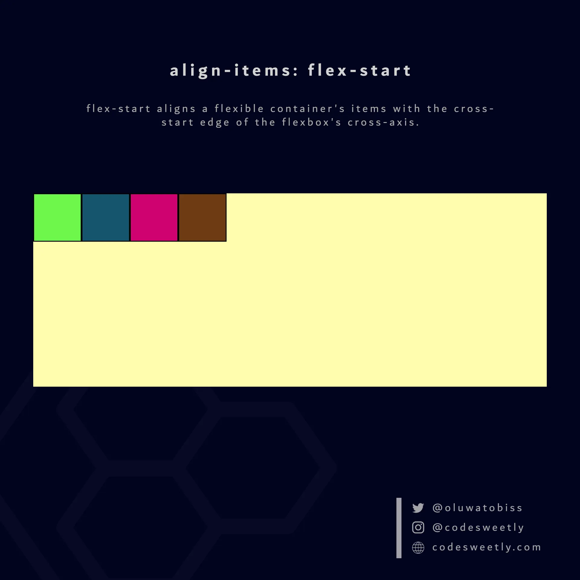
align-items’ flex-start value aligns flexible items to the flexbox’s cross-start edge
Here’s an example:
section {  display: flex;  align-items: flex-start;  background-color: orange;  margin: 10px;  height: 300px;}
div { border: 1px solid black; background-color: purple; color: white; padding: 10px; border-radius: 5px;}<section> <div>1</div> <div>2</div> <div>3</div> <div>4</div></section>We used the flex-start value to align the flexible items to the cross-start edge of the <section>’s cross-axis.
What Is align-items: center in CSS Flexbox?
Section titled “What Is align-items: center in CSS Flexbox?”center aligns a flexible container’s items to the center of the flexbox’s cross-axis.
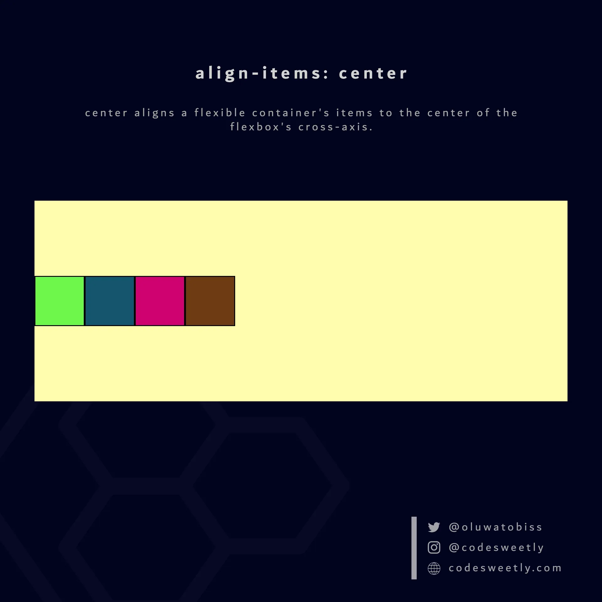
align-items’ center value aligns flexible items to the flexbox’s center
Here’s an example:
section {  display: flex;  align-items: center;  background-color: orange;  margin: 10px;  height: 300px;}
div { border: 1px solid black; background-color: purple; color: white; padding: 10px; border-radius: 5px;}<section> <div>1</div> <div>2</div> <div>3</div> <div>4</div></section>The snippet above used the center value to align the flexible items to the center of the <section>’s cross-axis.
What Is align-items: flex-end in CSS Flexbox?
Section titled “What Is align-items: flex-end in CSS Flexbox?”flex-end aligns a flexible container’s items with the cross-end edge of the flexbox’s cross-axis.
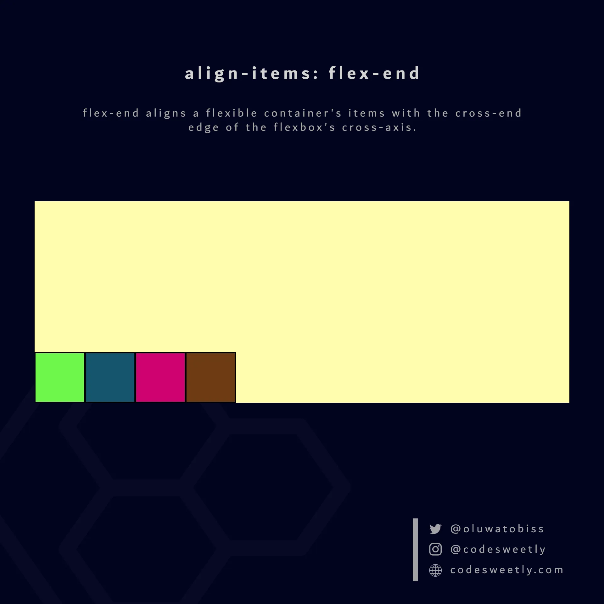
align-items’ flex-end value aligns flexible items to a flexbox’s cross-end edge
Here’s an example:
section {  display: flex;  align-items: flex-end;  background-color: orange;  margin: 10px;  height: 300px;}
div { border: 1px solid black; background-color: purple; color: white; padding: 10px; border-radius: 5px;}<section> <div>1</div> <div>2</div> <div>3</div> <div>4</div></section>We used the flex-end value to align the flexible items to the cross-end edge of the <section>’s cross-axis.
What Is align-items: baseline in CSS Flexbox?
Section titled “What Is align-items: baseline in CSS Flexbox?”baseline aligns a flexible container’s items with the baseline of the flexbox’s cross-axis.
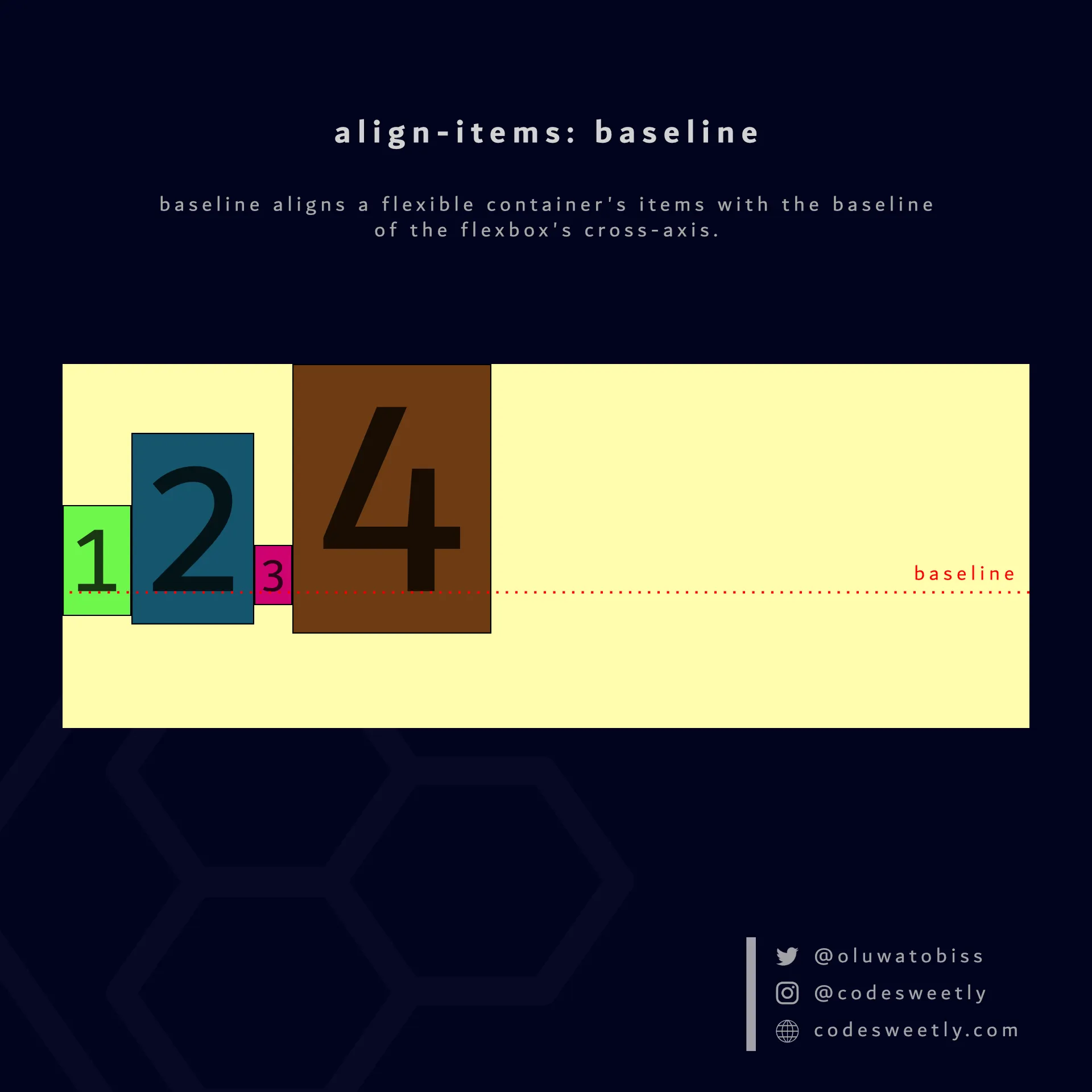
align-items’ baseline value aligns flexible items to a flexbox’s baseline
Here’s an example:
section {  display: flex;  align-items: baseline;  background-color: orange;  margin: 10px;}
div {  border: 1px solid black;  background-color: purple;  color: white;  padding: 10px;  border-radius: 5px;}
.flex-item1 {  font-size: 1.5rem;}
.flex-item2 {  font-size: 3rem;}
.flex-item3 {  font-size: 0.7rem;}
.flex-item4 { font-size: 5rem;}<section> <div class="flex-item1">1</div> <div class="flex-item2">2</div> <div class="flex-item3">3</div> <div class="flex-item4">4</div></section>The snippet above used the baseline value to align the flexible items to the <section>’s baseline.