flex-direction in CSS – How to Set Flex Children's Orientation
flex-direction tells browsers the specific direction (row or column) they should lay out a flexible container’s direct children.
In other words, flex-direction defines a flexbox’s main axis.
Main Axis vs. Cross Axis: What’s the Difference?
Section titled “Main Axis vs. Cross Axis: What’s the Difference?”A flexbox’s main axis is the layout orientation defined by a flex-direction property.
A flexbox’s cross axis is the perpendicular orientation to the main axis.
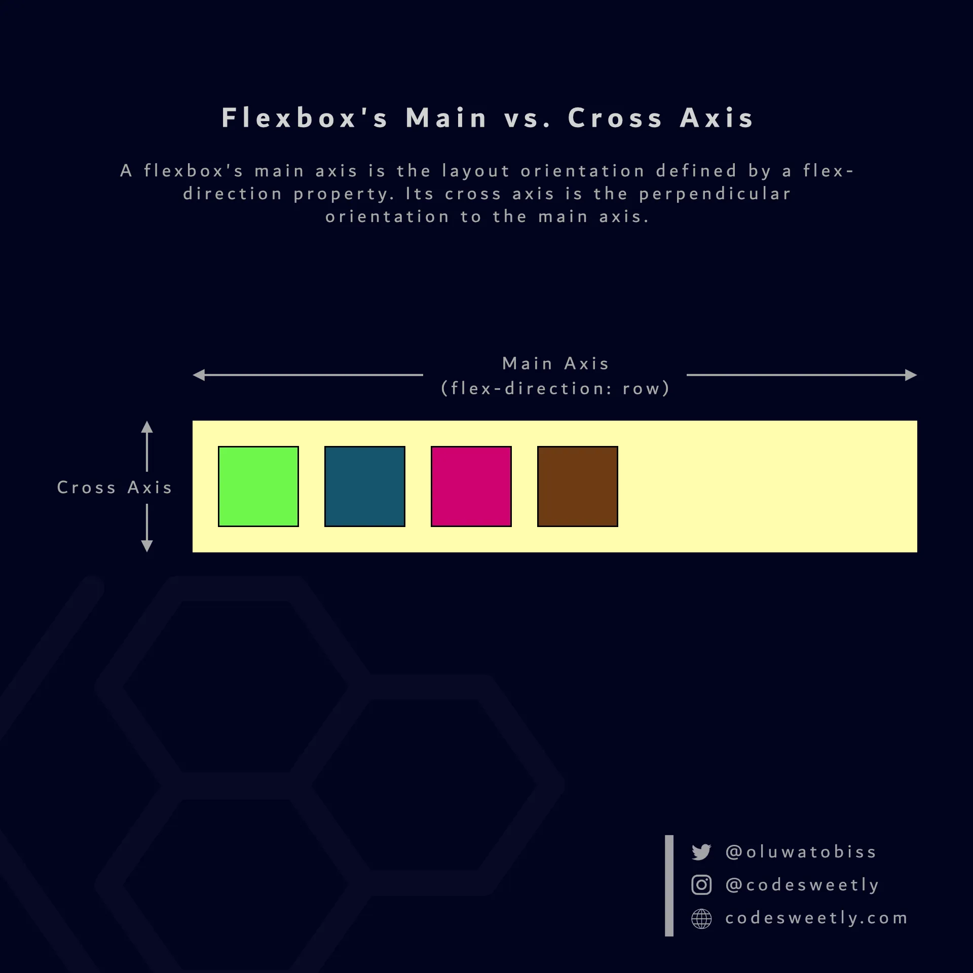
A flexbox’s flex-direction property determines the main and cross axis
For instance, suppose you set your flexible container’s flex-direction (main axis) to row. In that case, column will be the container’s cross axis.
row is flex-direction’s default value. Therefore, suppose you do not specify a flex-direction property. In that case, browsers will auto-arrange your flexible container’s items in the row direction of your browser’s default language.
Example: Set a Flex Container’s Main Axis to the Column Direction
Section titled “Example: Set a Flex Container’s Main Axis to the Column Direction”section { display: flex; flex-direction: column; background-color: orange; margin: 10px; padding: 7px;}
div { background-color: purple; color: white; margin: 5px; padding: 10px; border-radius: 5px;}<section> <div>1</div> <div>2</div> <div>3</div></section><section> <div>4</div> <div>5</div> <div>6</div></section>The snippet above organized the flexible <section> containers’ items in the column direction of your browser’s default language.