justify-content Property in CSS Grid Layouts
justify-content specifies how browsers should position a grid container’s columns along its row axis.
The justify-content property accepts the following values:
startcenterendstretchspace-betweenspace-aroundspace-evenly
What Is justify-content: start in CSS Grid?
Section titled “What Is justify-content: start in CSS Grid?”start positions the grid container’s columns with its row-start edge.
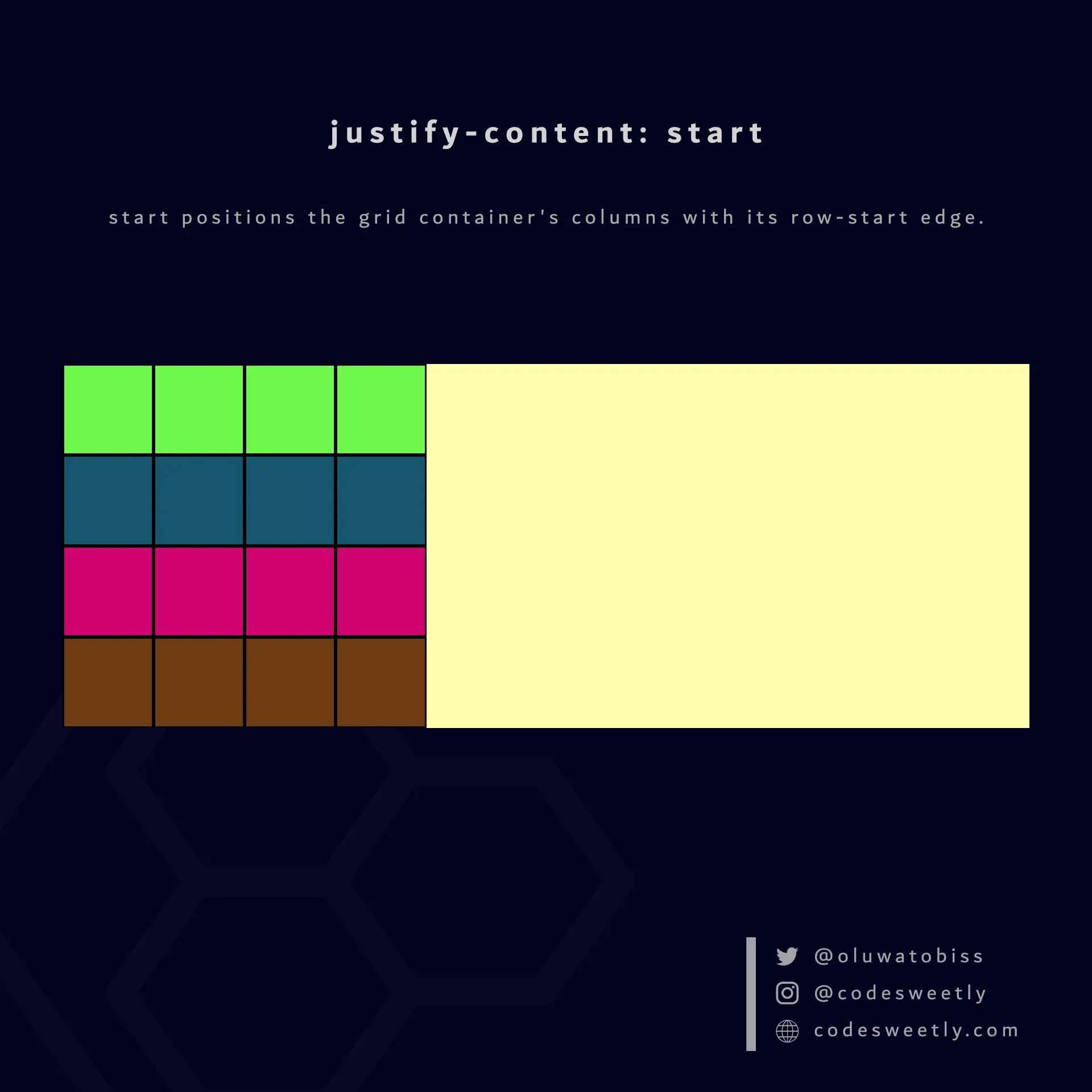
justify-content’s start value positions columns to the grid container’s row-start edge
Here’s an example:
section {  display: grid;  justify-content: start;  grid-template-columns: repeat(4, 40px);  background-color: orange;  margin: 10px;}
div { border: 1px solid black; background-color: purple; color: white; padding: 10px; border-radius: 5px; text-align: center;}<section> <div>1</div> <div>2</div> <div>3</div> <div>4</div> <div>5</div> <div>6</div> <div>7</div> <div>8</div></section>The snippet above used the start value to position the <section>’s columns to the grid container’s row-start edge.
What Is justify-content: center in CSS Grid?
Section titled “What Is justify-content: center in CSS Grid?”center positions the grid container’s columns to the center of the grid’s row axis.
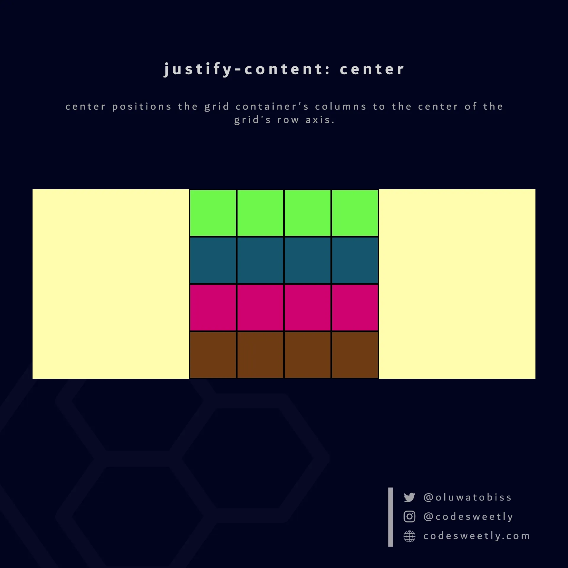
justify-content’s center value positions columns to the center of the grid container
Here’s an example:
section {  display: grid;  justify-content: center;  grid-template-columns: repeat(4, 40px);  background-color: orange;  margin: 10px;}
div { border: 1px solid black; background-color: purple; color: white; padding: 10px; border-radius: 5px; text-align: center;}<section> <div>1</div> <div>2</div> <div>3</div> <div>4</div> <div>5</div> <div>6</div> <div>7</div> <div>8</div></section>The snippet above used the center value to position the <section>’s columns to the center of the grid container.
What Is justify-content: end in CSS Grid?
Section titled “What Is justify-content: end in CSS Grid?”end positions a grid container’s columns with its row-end edge.
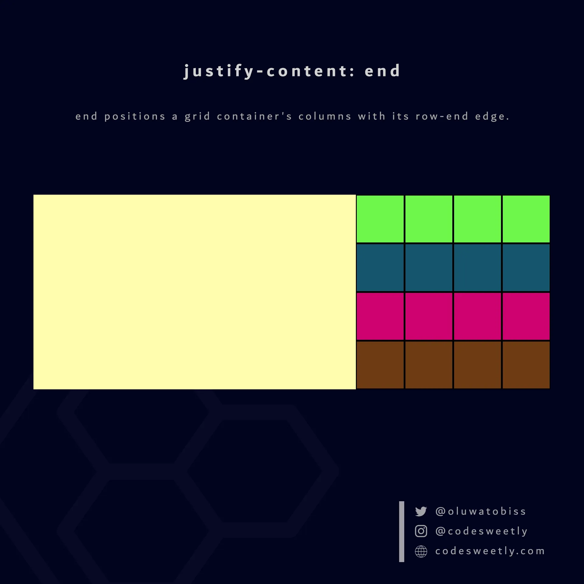
justify-content’s end value positions columns to the grid container’s row-end edge
Here’s an example:
section {  display: grid;  justify-content: end;  grid-template-columns: repeat(4, 40px);  background-color: orange;  margin: 10px;}
div { border: 1px solid black; background-color: purple; color: white; padding: 10px; border-radius: 5px; text-align: center;}<section> <div>1</div> <div>2</div> <div>3</div> <div>4</div> <div>5</div> <div>6</div> <div>7</div> <div>8</div></section>The snippet above used the end value to position the <section>’s columns to the grid container’s row-end edge.
What Is justify-content: space-between in CSS Grid?
Section titled “What Is justify-content: space-between in CSS Grid?”space-between does the following:
- It positions a grid container’s first column with its row-start edge.
- It positions the container’s last column with the row-end edge.
- It creates even spacing between each pair of columns between the first and last columns.
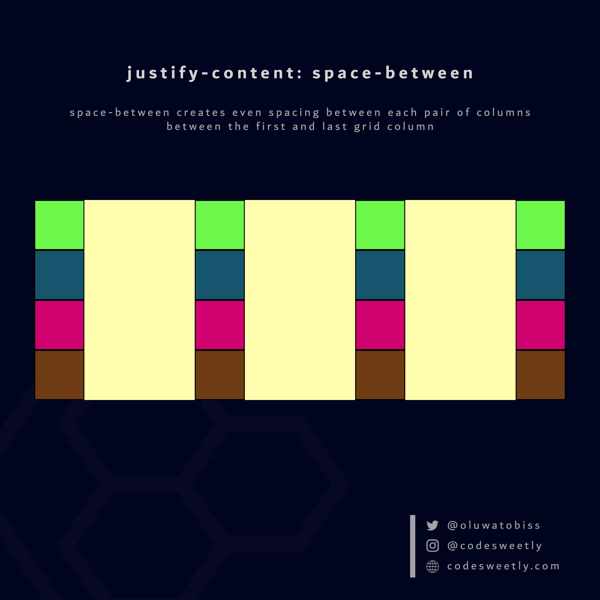
justify-content’s space-between value creates even spacing between each pair of columns between the first and last grid column
Here’s an example:
section {  display: grid;  justify-content: space-between;  grid-template-columns: repeat(4, 40px);  background-color: orange;  margin: 10px;}
div { border: 1px solid black; background-color: purple; color: white; padding: 10px; border-radius: 5px; text-align: center;}<section> <div>1</div> <div>2</div> <div>3</div> <div>4</div> <div>5</div> <div>6</div> <div>7</div> <div>8</div></section>The snippet above used the space-between value to create even spacing between each pair of columns between the first and last grid column.
What Is justify-content: space-around in CSS Grid?
Section titled “What Is justify-content: space-around in CSS Grid?”space-around assigns equal spacing to each side of a grid container’s columns.
Therefore, the space before the first column and after the last one is half the width of the space between each pair of columns.
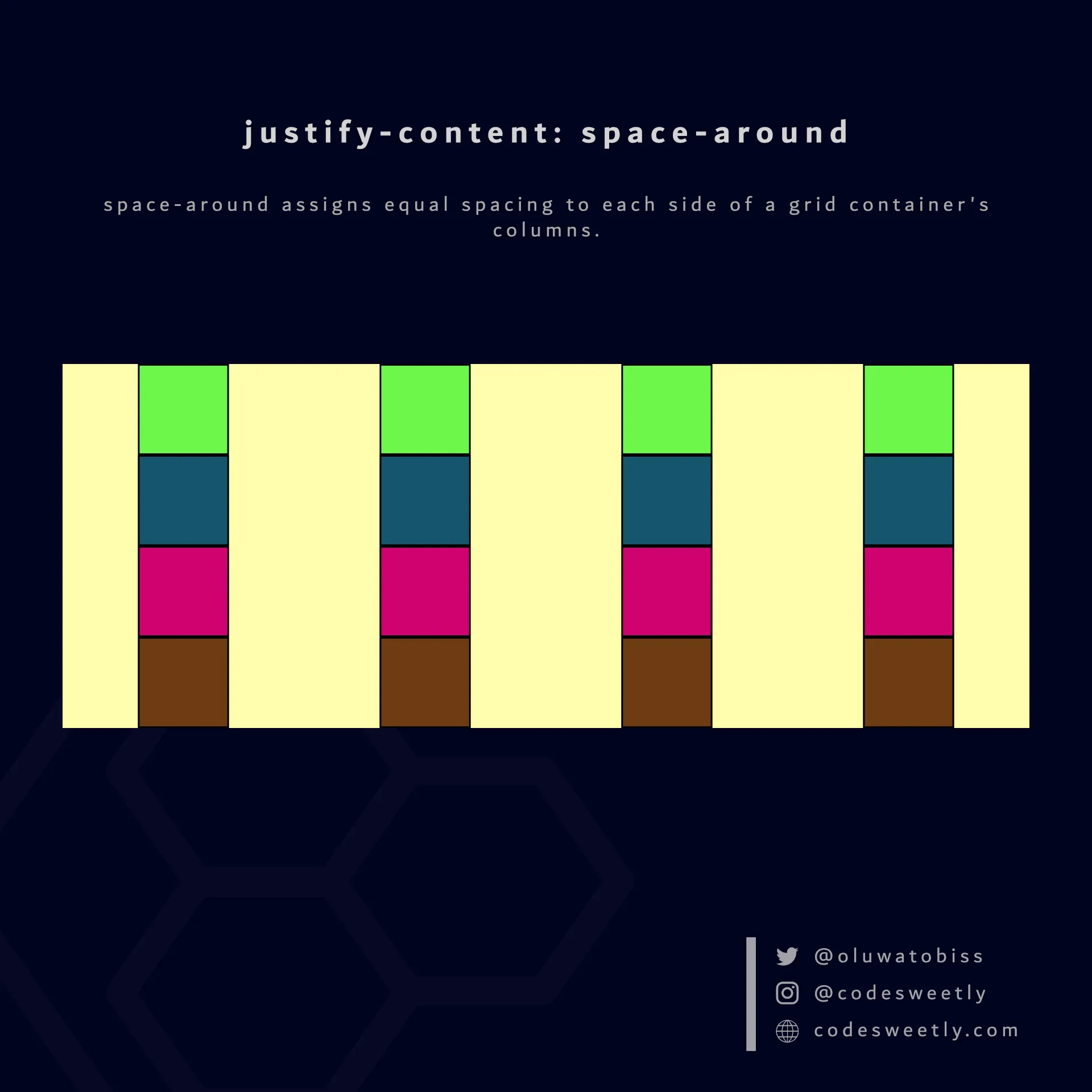
justify-content’s space-around value assigns equal spacing to each side of the grid container’s columns
Here’s an example:
section {  display: grid;  justify-content: space-around;  grid-template-columns: repeat(4, 40px);  background-color: orange;  margin: 10px;}
div { border: 1px solid black; background-color: purple; color: white; padding: 10px; border-radius: 5px; text-align: center;}<section> <div>1</div> <div>2</div> <div>3</div> <div>4</div> <div>5</div> <div>6</div> <div>7</div> <div>8</div></section>The snippet above used the space-around value to assign equal spacing to each side of the grid container’s columns.
What Is justify-content: space-evenly in CSS Grid?
Section titled “What Is justify-content: space-evenly in CSS Grid?”space-evenly assigns even spacing to both ends of a grid container and between its columns.
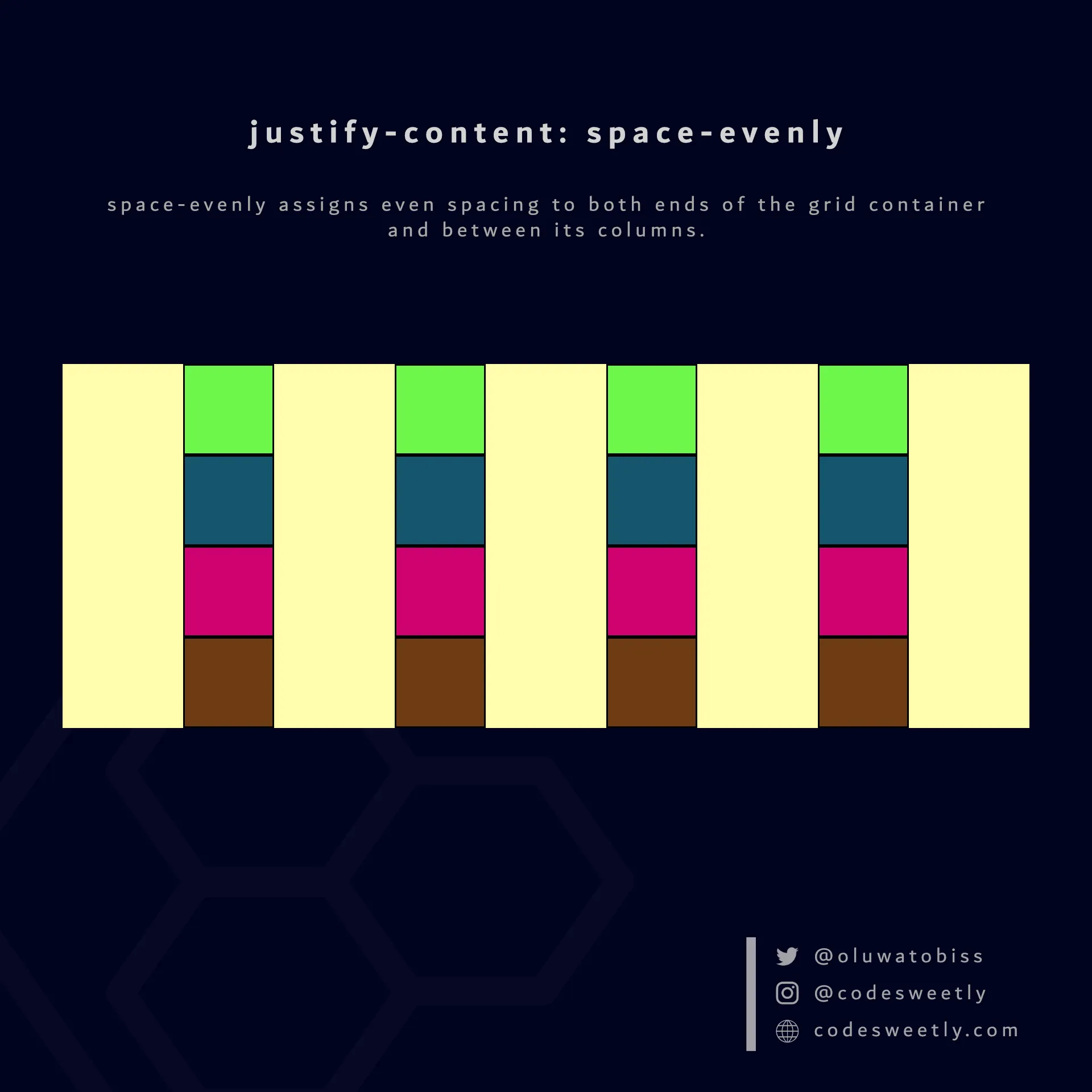
justify-content’s space-evenly value assigns even spacing to both ends of the grid container and between its columns
Here’s an example:
section {  display: grid;  justify-content: space-evenly;  grid-template-columns: repeat(4, 40px);  background-color: orange;  margin: 10px;}
div { border: 1px solid black; background-color: purple; color: white; padding: 10px; border-radius: 5px; text-align: center;}<section> <div>1</div> <div>2</div> <div>3</div> <div>4</div> <div>5</div> <div>6</div> <div>7</div> <div>8</div></section>We used the space-evenly value to assign even spacing to both ends of the grid container and between its columns.