justify-self Property in CSS Grid Layouts
justify-self specifies how browsers should position the selected grid item along its cell’s row (inline) axis.
The justify-self property accepts the following values:
stretchstartcenterend
Let’s discuss the four values.
What Is justify-self: stretch in CSS Grid?
Section titled “What Is justify-self: stretch in CSS Grid?”stretch is justify-self’s default value. It stretches the selected grid item to fill its cell’s row (inline) axis.
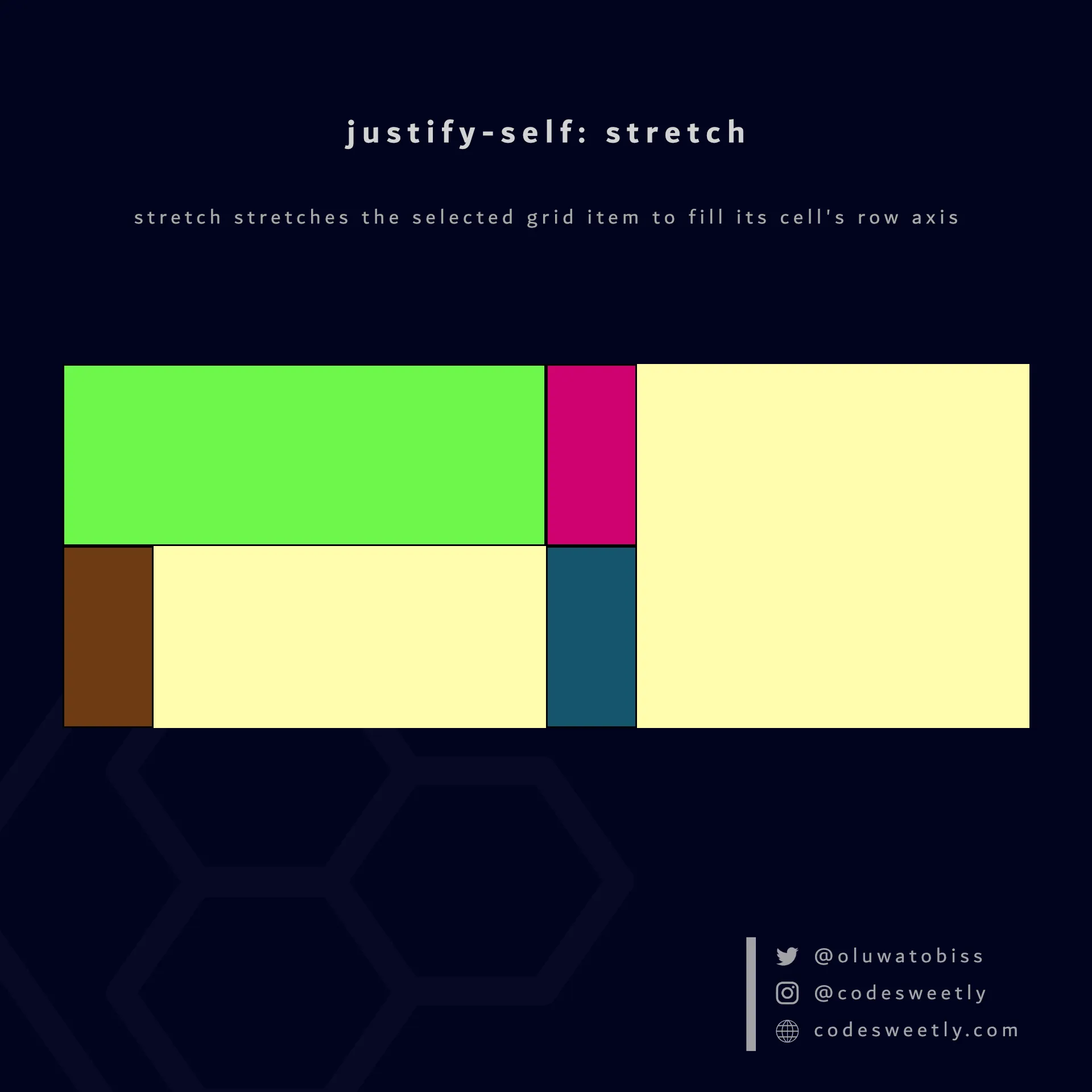
justify-self’s stretch value stretches the selected grid item to fill its cell’s row axis
Here’s an example:
section {  display: grid;  justify-items: start;  grid-template-columns: 1fr 1fr;  background-color: orange;  margin: 10px;}
div {  border: 1px solid black;  background-color: purple;  color: white;  padding: 10px;  border-radius: 5px;}
.grid-item1 { justify-self: stretch;}<section> <div class="grid-item1">1</div> <div class="grid-item2">2</div> <div class="grid-item3">3</div> <div class="grid-item4">4</div></section>The snippet above used the stretch value to stretch grid-item1 to fill its cell’s row axis.
What Is justify-self: start in CSS Grid?
Section titled “What Is justify-self: start in CSS Grid?”start positions the selected grid item with the row-start edge of its cell’s row axis.
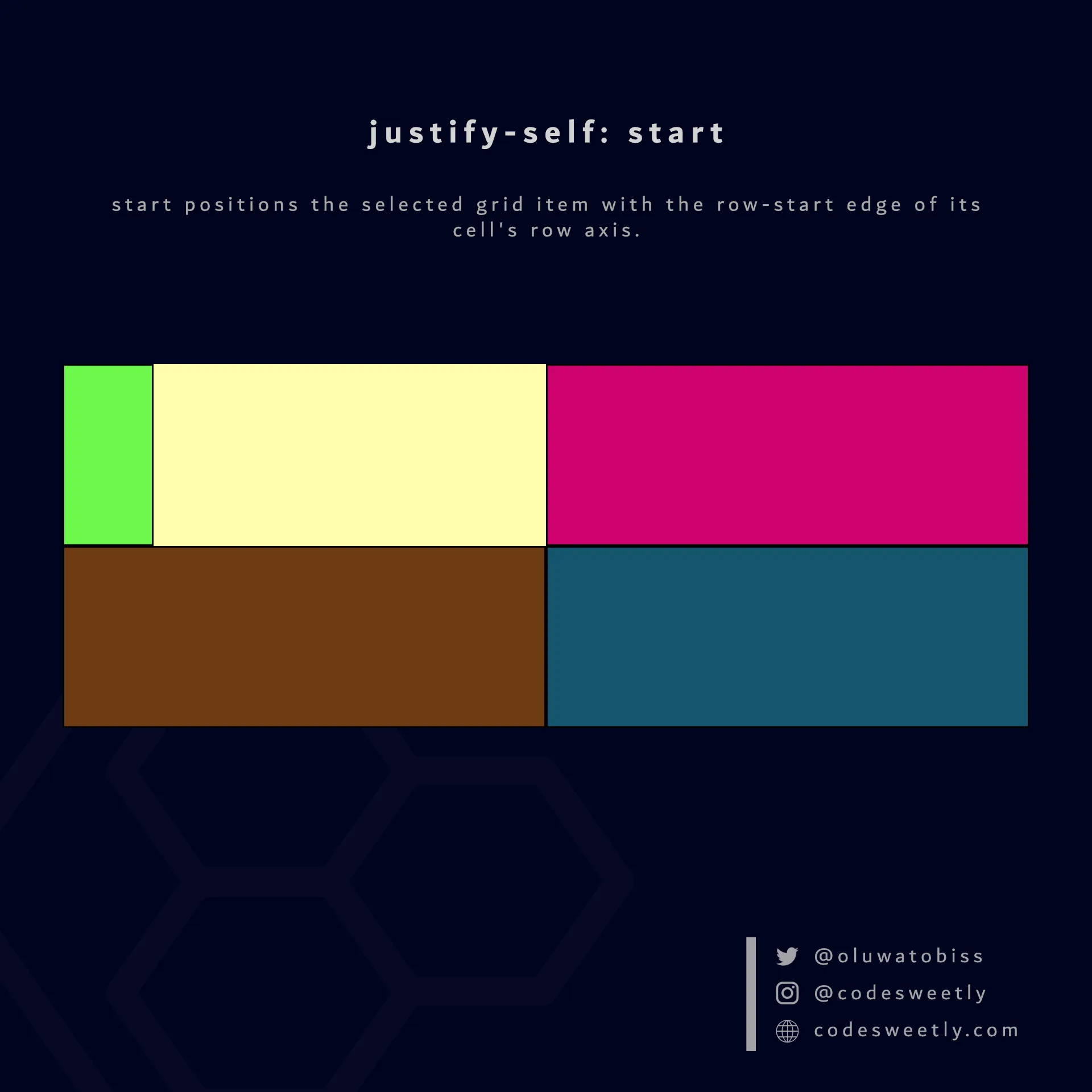
justify-self’s start value positions the selected grid item to its cell’s row-start edge
Here’s an example:
section {  display: grid;  grid-template-columns: 1fr 1fr;  background-color: orange;  margin: 10px;}
div {  border: 1px solid black;  background-color: purple;  color: white;  padding: 10px;  border-radius: 5px;}
.grid-item1 { justify-self: start;}<section> <div class="grid-item1">1</div> <div class="grid-item2">2</div> <div class="grid-item3">3</div> <div class="grid-item4">4</div></section>The snippet above used the start value to position grid-item1 to its cell’s row-start edge.
What Is justify-self: center in CSS Grid?
Section titled “What Is justify-self: center in CSS Grid?”center positions the selected grid item to the center of its cell’s row axis.
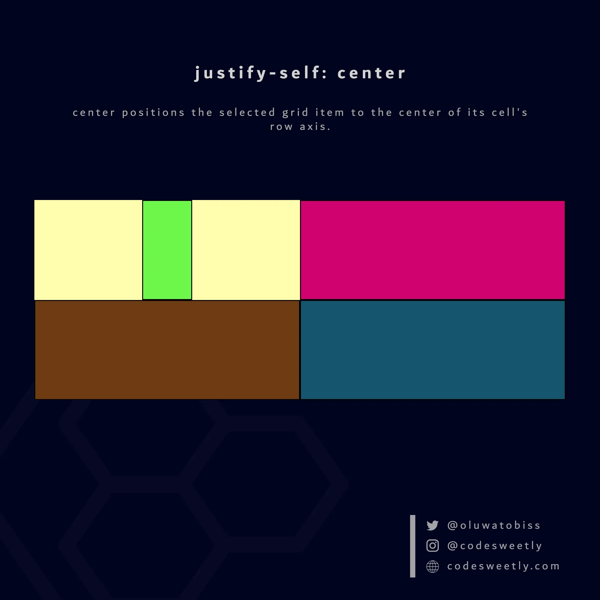
justify-self’s center value positions the selected grid item to its cell’s center
Here’s an example:
section {  display: grid;  grid-template-columns: 1fr 1fr;  background-color: orange;  margin: 10px;}
div {  border: 1px solid black;  background-color: purple;  color: white;  padding: 10px;  border-radius: 5px;}
.grid-item1 { justify-self: center;}<section> <div class="grid-item1">1</div> <div class="grid-item2">2</div> <div class="grid-item3">3</div> <div class="grid-item4">4</div></section>The snippet above used the center value to position grid-item1 to its cell’s center.
What Is justify-self: end in CSS Grid?
Section titled “What Is justify-self: end in CSS Grid?”end positions the selected grid item with the row-end edge of its cell’s row axis.
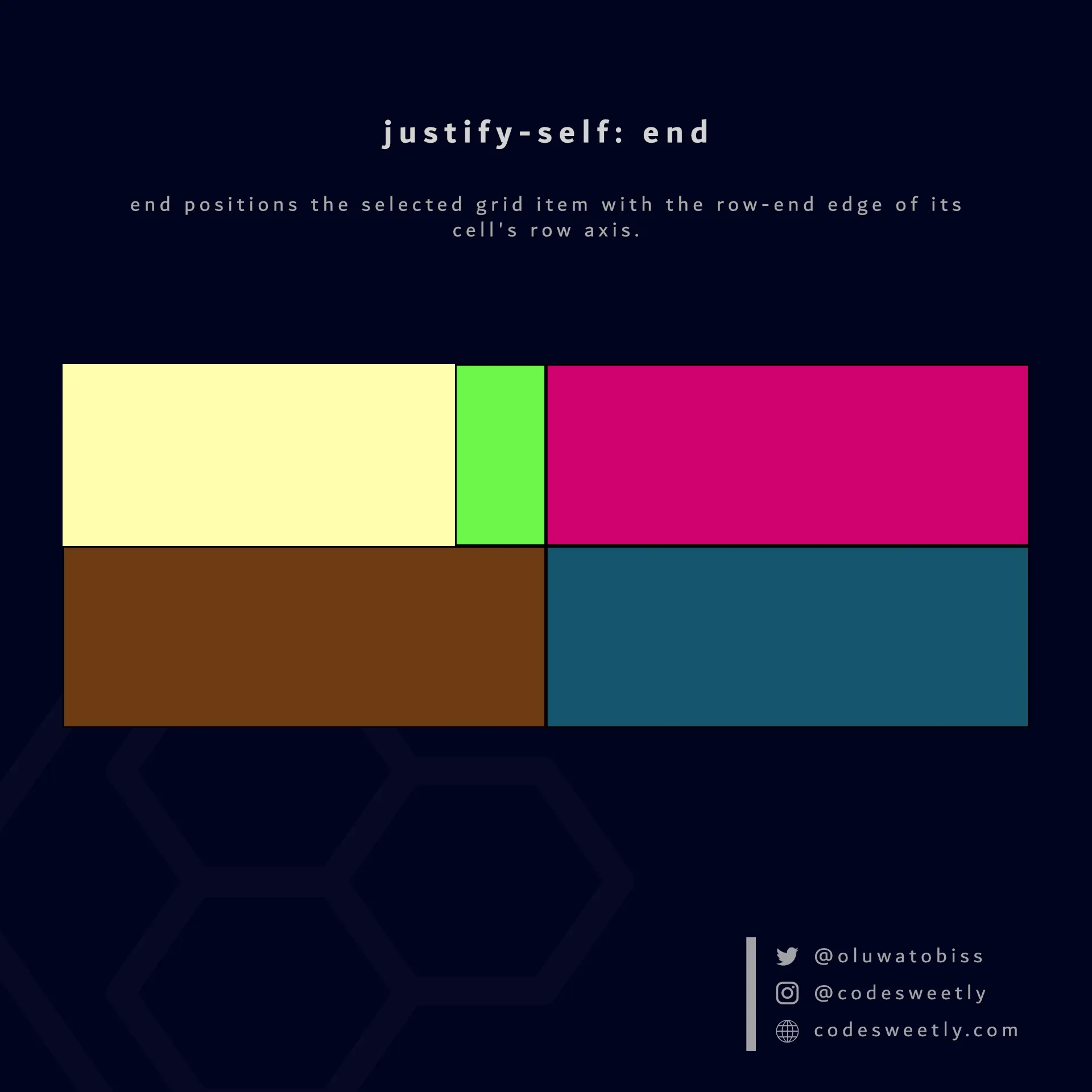
justify-self’s end value positions the selected grid item to its cell’s row-end edge
Here’s an example:
section {  display: grid;  grid-template-columns: 1fr 1fr;  background-color: orange;  margin: 10px;}
div {  border: 1px solid black;  background-color: purple;  color: white;  padding: 10px;  border-radius: 5px;}
.grid-item1 { justify-self: end;}<section> <div class="grid-item1">1</div> <div class="grid-item2">2</div> <div class="grid-item3">3</div> <div class="grid-item4">4</div></section>The snippet above used the end value to position grid-item1 to its cell’s row-end edge.