CSS Grid Lines – What Is a CSS Grid Line?
CSS grid lines are the lines browsers create on a grid container when you define the grid-template-columns or grid-template-rows property.
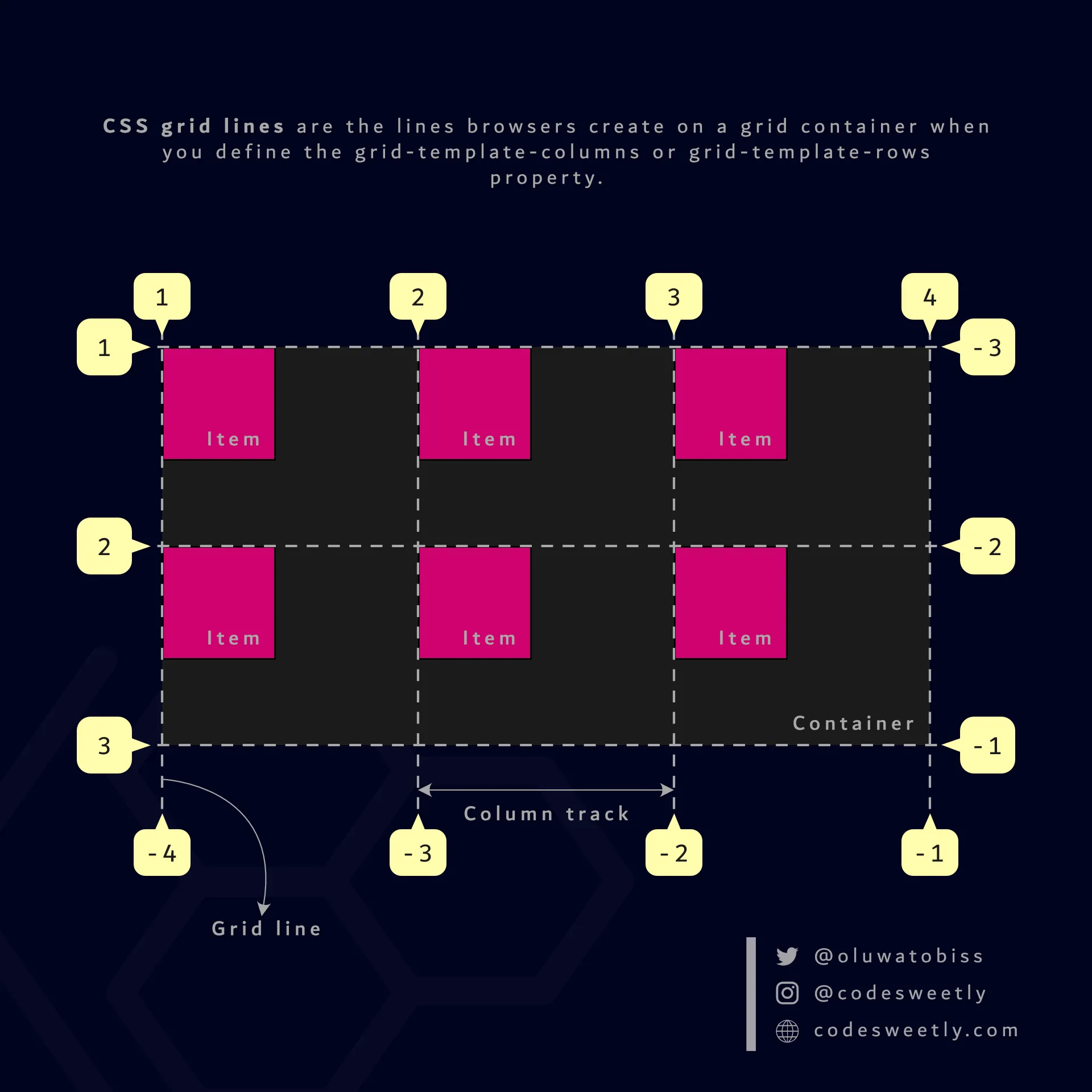
The CSS grid-template-columns and grid-template-rows properties determine the number of a grid container’s lines
The two types of CSS grid lines are:
- Grid column lines
- Grid row lines
What Is a Grid Column Line?
Section titled “What Is a Grid Column Line?”Grid column lines are the lines browsers create on a grid container’s column (block) axis when you define the grid-template-columns property.
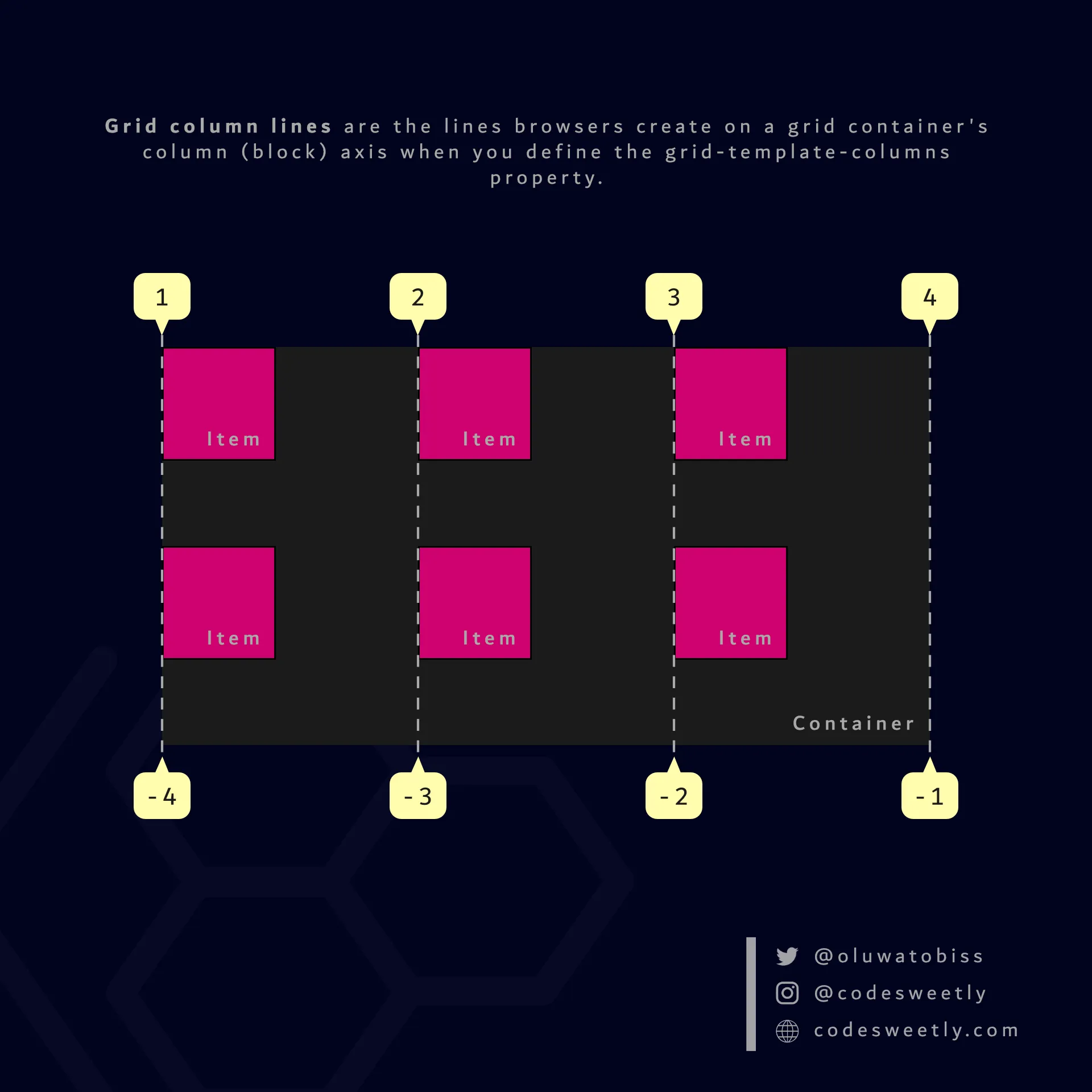
A CSS grid-template-columns property determines the number of a grid container’s column lines
The numbering of the grid column lines starts from number one (1) at the grid container’s column-start edge.
Therefore, suppose your writing language script is horizontal left-to-right—like English. In that case, your grid column line 1 will be at the top-left of the grid container.
However, suppose your writing language script is horizontal right-to-left—like Arabic. In that case, your grid column line 1 will be at the top-right of the grid container.
What Is a Grid Row Line?
Section titled “What Is a Grid Row Line?”Grid row lines are the lines browsers create on a grid container’s row (inline) axis when you define the grid-template-rows property.
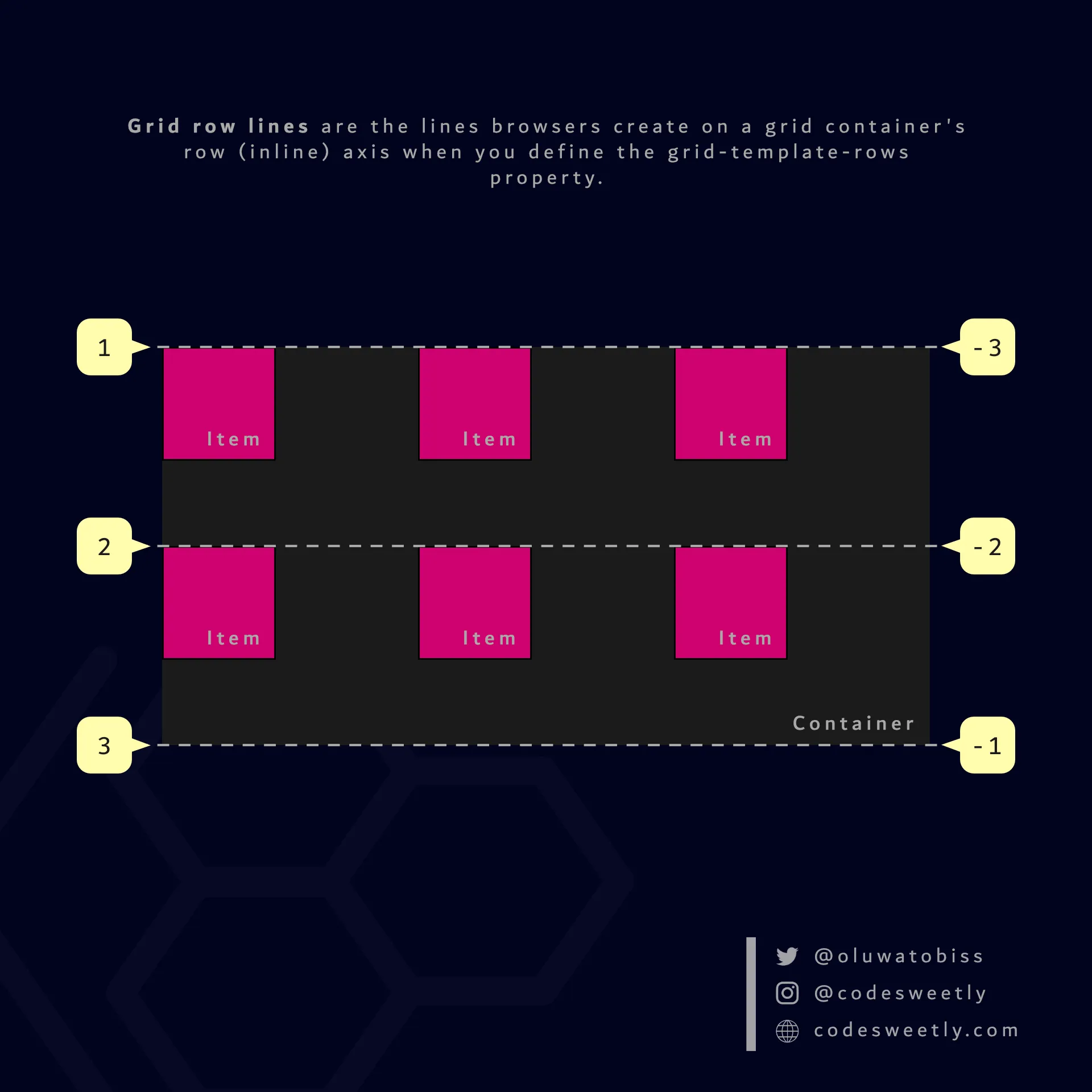
A CSS grid-template-rows property determines the number of a grid container’s row lines
The numbering of the grid row lines starts from number one (1) at the grid container’s row-start edge.
How to Name Grid Lines
Section titled “How to Name Grid Lines”Suppose you wish to name some (or all) of your grid lines. In that case, specify the name inside square brackets ([]) while defining the number and widths of your grid container’s columns or rows.
Example: How to name a grid container’s column lines
Section titled “Example: How to name a grid container’s column lines”grid-template-columns: [first-line] 20px [second-line] 50px [last-line];Here’s what we did in the CSS snippet above:
- We defined a two-columns grid container with widths of
20pxand50pxrespectively. - We used the
[line-name]syntax to name the grid container’s lines.
Therefore, instead of line numbers, you can use the specified names to place grid items like so:
section {  display: grid;  grid-template-columns: 1fr 1fr [third-line] 1fr;  background-color: orange;  margin: 50px;  min-height: 300px;}
div {  border: 1px solid black;  background-color: purple;  color: white;  padding: 20px;  border-radius: 5px;}
.grid-item1 { grid-column-start: third-line;}<section> <div class="grid-item1">1</div> <div class="grid-item2">2</div> <div class="grid-item3">3</div> <div class="grid-item4">4</div> <div class="grid-item5">5</div> <div class="grid-item6">6</div> <div class="grid-item7">7</div> <div class="grid-item8">8</div> <div class="grid-item9">9</div></section>The snippet above used the third-line value to start grid-item1 at the grid container’s third column line.
Note that you can specify multiple names for a single line.
Example: How to specify multiple names for a single grid line
Section titled “Example: How to specify multiple names for a single grid line”To specify multiple names for a single grid line, define the names inside a square bracket as follows:
section {  display: grid;  grid-template-columns: 1fr [second-line ads-end] 1fr [third-line last-column-start-line] 1fr;  background-color: orange;  margin: 50px;  min-height: 300px;}
div {  border: 1px solid black;  background-color: purple;  color: white;  padding: 20px;  border-radius: 5px;}
.grid-item1 {  grid-column-start: last-column-start-line;}
.grid-item5 { grid-column-start: ads-end;}<section> <div class="grid-item1">1</div> <div class="grid-item2">2</div> <div class="grid-item3">3</div> <div class="grid-item4">4</div> <div class="grid-item5">5</div> <div class="grid-item6">6</div> <div class="grid-item7">7</div> <div class="grid-item8">8</div> <div class="grid-item9">9</div></section>The snippet above used multiple names for the second and third column grid lines.