CSS rotate3d() Function – How to Rotate Elements in 3D
rotate3d() transforms an element by rotating it three-dimensionally around the x-, y-, and z-axis.
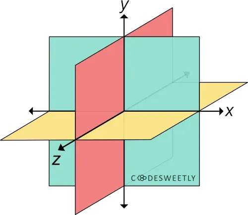
A three-dimensional Cartesian coordinate system showing the X-, Y-, and Z-axis
Syntax of the CSS rotate3d() Function
Section titled “Syntax of the CSS rotate3d() Function”rotate3d() accepts four arguments. Here is the syntax:
element { transform: rotate3d(x, y, z, angle);}Note the following:
- The
x,y, andzarguments are numbers specifying the x-, y-, and z-coordinates. - The coordinates are the axis around which the element will rotate.
- The
angleargument specifies the element’s angle of rotation. anglecan be in degree, gradian, radian, or turn.- An
angleargument consists of a number followed by the unit you wish to use—for instance,45deg.
Examples of the CSS rotate3d() Function
Section titled “Examples of the CSS rotate3d() Function”Below are some examples of how the CSS rotate3d() function works.
How to do a 70-degree rotation around the Z-axis
Section titled “How to do a 70-degree rotation around the Z-axis”img { transform: rotate3d(0, 0, 1, 70deg); width: 80%;}<img src="https://cdn.pixabay.com/photo/2022/09/26/23/26/african-american-7481724_960_720.jpg" alt=""/>The snippet above used the rotate3d() function to specify a seventy-degree (70⁰) rotation for the image around the Z-axis.
How to do a 70-degree rotation around the X-, Y-, and Z-axis
Section titled “How to do a 70-degree rotation around the X-, Y-, and Z-axis”img { transform: rotate3d(1, 1, 1, 70deg); width: 80%;}<img src="https://cdn.pixabay.com/photo/2022/09/26/23/26/african-american-7481724_960_720.jpg" alt=""/>The snippet above used the rotate3d() function to specify a seventy-degree (70⁰) rotation for the image around the x-, y-, and z-axis.
CSS rotate3d() Function vs. rotate Property: What’s the Difference?
Section titled “CSS rotate3d() Function vs. rotate Property: What’s the Difference?”CSS rotate3d() functions and CSS rotate property provide two similar ways to specify rotation transformations.
The main differences between the two rotation techniques are as follows:
- The CSS
rotateproperty allows rotating an element without using the CSStransformproperty. - The CSS
rotateproperty’s syntax is shorter than its function alternative. - The CSS
rotateproperty saves you from remembering the specific order to position the transform functions. - Browsers calculate the transform functions’ matrix in the order you assigned them to the CSS
transformproperty—from left to right. - Browsers calculate the
transformproperties’ matrix in the following transformation matrix order:translaterotatescale
Here’s an example:
Use CSS rotate property to do a 70-degree rotation around the X-, Y-, and Z-axis:
img { rotate: 1 1 1 70deg; /* Equal to a transform: rotate3d(1, 1, 1, 70deg) property */ width: 80%;}<img src="https://cdn.pixabay.com/photo/2022/09/26/23/26/african-american-7481724_960_720.jpg" alt=""/>The snippet above used the rotate property to specify a seventy-degree (70⁰) rotation for the image around the x-, y-, and z-axis.