CSS scale3d() Function – How to Resize Elements in 3D
scale3d() transforms an element by resizing (scaling) it three-dimensionally from a fixed point along the x-, y-, and z-axis.
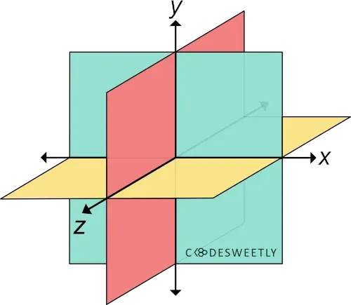
A three-dimensional Cartesian coordinate system showing the X-, Y-, and Z-axis
Syntax of the CSS scale3d() Function
Section titled “Syntax of the CSS scale3d() Function”scale3d() accepts three arguments. Here is the syntax:
element { transform: scale3d(x, y, z);}The x, y, and z arguments are numbers specifying the x-, y-, and z-coordinates. The coordinates are the axis along which browsers will scale the element.
Examples of the CSS scale3d() Function
Section titled “Examples of the CSS scale3d() Function”Below are some examples of how the CSS scale3d() function works.
How to use scale3d() with CSS perspective() and rotateX() functions
Section titled “How to use scale3d() with CSS perspective() and rotateX() functions”img { transform: perspective(370px) scale3d(1, 1, 5) rotateX(17deg); width: 80%;}<img src="https://cdn.pixabay.com/photo/2022/09/26/23/26/african-american-7481724_960_720.jpg" alt=""/>Here’s what we did in the snippet above:
- We used the
perspective()function to define a370pxdistance between the user and the z=0 plane. - The
scale3d()function specifies a scale factor of1,1, and5for the image along the x-, y-, and z-axis. - We used the
rotateX()function to rotate the image seventeen-degree (17⁰) around the x-axis.
How to scale elements three-dimensionally
Section titled “How to scale elements three-dimensionally”img { width: 40%;}
.second-image { transform: scale3d(5, 3, 0.05); transform-origin: top left;}<img class="first-image" src="https://cdn.pixabay.com/photo/2022/09/26/23/26/african-american-7481724_960_720.jpg" alt=""/>
<img class="second-image" src="https://cdn.pixabay.com/photo/2022/09/26/23/26/african-american-7481724_960_720.jpg" alt=""/>We used the scale3d() function to specify a scale factor of 5, 3, and 0.05 for the image along the x-, y-, and z-axis.