CSS translate3d() Function – How to Reposition Elements Three-Dimensionally
translate3d() transforms an element by repositioning (translating) it three-dimensionally along the x-, y-, and z-axis.
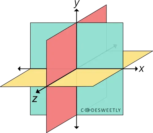
A three-dimensional Cartesian coordinate system showing the X-, Y-, and Z-axis
Syntax of the CSS translate3d() Function
Section titled “Syntax of the CSS translate3d() Function”translate3d() accepts three arguments. Here is the syntax:
element { transform: translate3d(x, y, z);}Note the following:
- The
xargument can be a length or percentage value. It specifies the distance you wish to move the element from its original x-axis position. - The
yargument can be a length or percentage value. It defines the distance you wish to move the element from its original y-axis position. zcan only be a length—not a percentage. It defines the distance you wish to move the element from its original z-axis position.
Examples of the CSS translate3d() Function
Section titled “Examples of the CSS translate3d() Function”Below are some examples of how the CSS translate3d() function works.
How to translate an element along only the X-axis
Section titled “How to translate an element along only the X-axis”img { transform: translate3d(150px, 0, 0); width: 80%;}<img src="https://cdn.pixabay.com/photo/2022/09/26/23/26/african-american-7481724_960_720.jpg" alt=""/>The snippet above used the translate3d() function to reposition the image 150px away from its original position along the x-axis.
How to translate elements three-dimensionally
Section titled “How to translate elements three-dimensionally”img { width: 40%;}
.second-image { transform: perspective(300px) translate3d(15%, 45%, 200px);}<img class="first-image" src="https://cdn.pixabay.com/photo/2022/09/26/23/26/african-american-7481724_960_720.jpg" alt=""/>
<img class="second-image" src="https://cdn.pixabay.com/photo/2022/09/26/23/26/african-american-7481724_960_720.jpg" alt=""/>The snippet above used the translate3d() function to reposition the image 15% away from its original position along the x-axis. 45% from its y-axis. And 200px from its z-axis.
CSS translate3d() Function vs. translate Property: What’s the Difference?
Section titled “CSS translate3d() Function vs. translate Property: What’s the Difference?”The CSS translate3d() function and the CSS translate property provide two similar ways to specify a translation transformation.
The main differences between the two translation techniques are as follows:
- The CSS
translateproperty allows translating an element without using the CSStransformproperty. - The CSS
translateproperty’s syntax is shorter than its function alternative. - The CSS
translateproperty saves you from remembering the specific order to position the transform functions. - Browsers calculate the transform functions’ matrix in the order you assigned them to the CSS
transformproperty—from left to right. - Browsers calculate the
transformproperties’ matrix in the following transformation matrix order:translaterotatescale
Here’s an example:
Use CSS translate property to translate an element three-dimensionally:
img {  width: 40%;}
div {  perspective: 300px;}
.second-image { translate: 50% 25% 200px; /* Equal to a transform: translate3d(50%, 25%, 200px) property */}<img class="first-image" src="https://cdn.pixabay.com/photo/2022/09/26/23/26/african-american-7481724_960_720.jpg" alt=""/>
<div> <img class="second-image" src="https://cdn.pixabay.com/photo/2022/09/26/23/26/african-american-7481724_960_720.jpg" alt="" /></div>The snippet above used the translate property to reposition the image 50% away from its original position along the x-axis. 25% from its y-axis. And 200px from its z-axis.