CSS Flexbox Tutorial – What Is Flex and Inline-Flex?
Flexbox makes browsers display selected HTML elements as flexible box models.
Flexbox allows easy resizing and repositioning of a flexible container and its items one-dimensionally.
Flex Container vs. Flex Item: What’s the Difference?
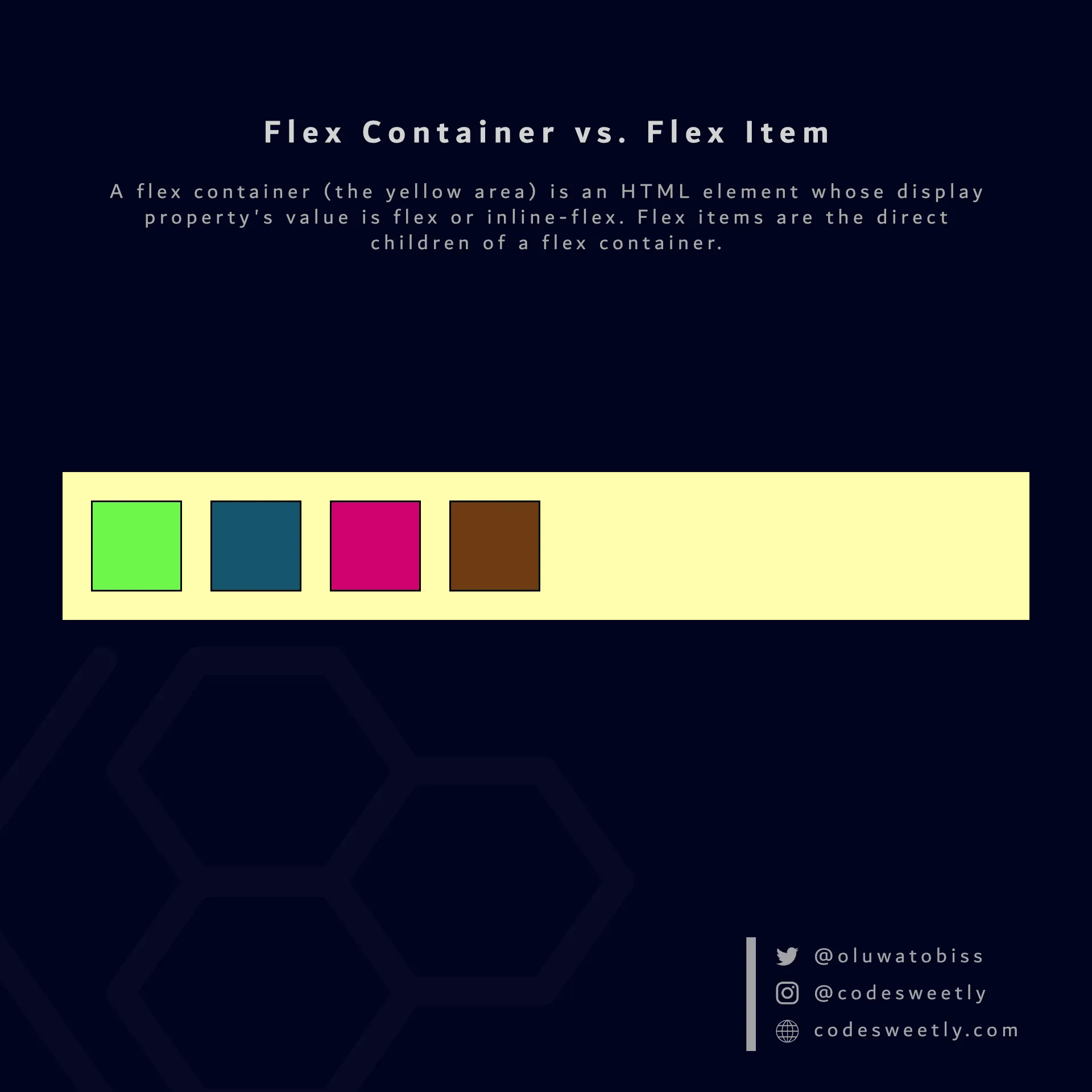
Section titled “Flex Container vs. Flex Item: What’s the Difference?”A flex container is an HTML element whose display property’s value is flex or inline-flex.
Flex items are the direct children of a flex container.

A flex container (the large yellow area in the image) is an HTML element whose display property’s value is flex or inline-flex. Flex items (the smaller boxes within the yellow container) are the direct children of a flex container.
What Is a flex Value in CSS?
Section titled “What Is a flex Value in CSS?”flex tells browsers to display the selected HTML element as a block-level flexible box model.
In other words, setting an element’s display property’s value to flex turns the box model into a block-level flexbox.
Here’s an example:
section {  display: flex;  background-color: orange;  margin: 10px;  padding: 7px;}
div { background-color: purple; color: white; margin: 5px; padding: 10px; border-radius: 5px;}<section> <div>1</div> <div>2</div> <div>3</div></section><section> <div>4</div> <div>5</div> <div>6</div></section>The snippet above used the flex value to convert the HTML document’s <section> elements from regular <section> nodes to block-level flexible box models.
Let’s now discuss inline-flex.
What Is an inline-flex Value in CSS?
Section titled “What Is an inline-flex Value in CSS?”inline-flex tells browsers to display the selected HTML element as an inline-level flexible box model.
In other words, setting an element’s display property’s value to inline-flex turns the box model into an inline-level flexbox.
Here’s an example:
section {  display: inline-flex;  background-color: orange;  margin: 10px;  padding: 7px;}
div { background-color: purple; color: white; margin: 5px; padding: 10px; border-radius: 5px;}<section> <div>1</div> <div>2</div> <div>3</div></section><section> <div>4</div> <div>5</div> <div>6</div></section>The snippet above used the inline-flex value to convert the HTML document’s <section> elements from regular <section> nodes to inline-level flexible box models.
Properties for Specifying Flexbox’s Layout
Section titled “Properties for Specifying Flexbox’s Layout”On converting a regular HTML element to a flex (or inline-flex) box model, Flexbox provides two types of properties for positioning the flexible box and its direct children:
- Flexible container’s properties
- Flexible item’s properties
What Are the Flexible Container’s Properties?
Section titled “What Are the Flexible Container’s Properties?”A flexible container’s properties specify how browsers should layout items within the flexible box model.
The six (6) types of flex container properties are:
What Are the Flexible Item’s Properties?
Section titled “What Are the Flexible Item’s Properties?”A flexible item’s properties specify how browsers should layout a specified item within the flexible box model.
The six (6) types of flex item properties are: