CSS scaleZ() Function – How to Resize Elements along Z-axis
scaleZ() transforms an element by resizing (scaling) it three-dimensionally from a fixed point along the z-axis.
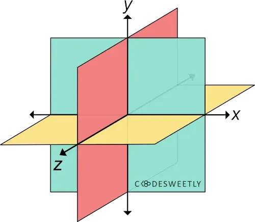
A three-dimensional Cartesian coordinate system showing the X-, Y-, and Z-axis
Syntax of the CSS scaleZ() Function
Section titled “Syntax of the CSS scaleZ() Function”scaleZ() accepts a single argument. Here is the syntax:
element { transform: scaleZ(number);}Note the following:
- The
scaleZ(number)function is equivalent toscale3d(1, 1, number). - The
numberargument specifies the element’s scaling factor along the z-axis. - Whenever you include scaling or zooming animations in your app, provide users an option to turn off animations. This option is necessary because scaling and zooming animations cause accessibility issues.
Examples of the CSS scaleZ() Function
Section titled “Examples of the CSS scaleZ() Function”We often use scaleZ() with other CSS functions such as perspective(), translateZ(), and rotateX(). Below are some examples.
How to use scaleZ() with CSS perspective() and rotateX() functions
Section titled “How to use scaleZ() with CSS perspective() and rotateX() functions”img { transform: perspective(370px) scaleZ(5) rotateX(17deg); width: 80%;}<img src="https://cdn.pixabay.com/photo/2022/09/26/23/26/african-american-7481724_960_720.jpg" alt=""/>Here’s what we did in the snippet above:
- We used the
perspective()function to define a370pxdistance between the user and the z=0 plane. - The
scaleZ()function specifies a scale factor of5for the image along the z-axis. - We used the
rotateX()function to rotate the image seventeen-degree (17⁰) around the x-axis.
How to use scaleZ() with CSS perspective() and translateZ() functions
Section titled “How to use scaleZ() with CSS perspective() and translateZ() functions”img { width: 40%;}
.second-image { transform: perspective(370px) scaleZ(5) translateZ(30px);}<img class="first-image" src="https://cdn.pixabay.com/photo/2022/09/26/23/26/african-american-7481724_960_720.jpg" alt=""/>
<img class="second-image" src="https://cdn.pixabay.com/photo/2022/09/26/23/26/african-american-7481724_960_720.jpg" alt=""/>Here’s what we did in the snippet above:
- We used the
perspective()function to define a370pxdistance between the user and the z=0 plane. - The
scaleZ()function specifies a scale factor of5for the image along the z-axis. - We used the
translateZ()function to reposition thesecond-imagethirty pixels (30px) away from its original position along the z-axis.